Monday, 9 October 2017

John Fellows - Printmaking/Media Handling

John Fellows is a printmaker I looked at last year for a unit called Specialist Techniques where I chose.. well.. Printmaking. John collects a variety of paper, hand written letters and maps dating back to 1880's and collages them to print on to make a completely unique print with his completely unique style.
Now collaging paper together to print on is actually something I've been heavily thinking about for a couple of days while my mind has been what I like to call "art ticking" so I thought doing a report on John would be a great idea.


We Are All In This Together (Sink or Swim) / 16”x20” / linoleum carving collage on used nautical chart / 2011
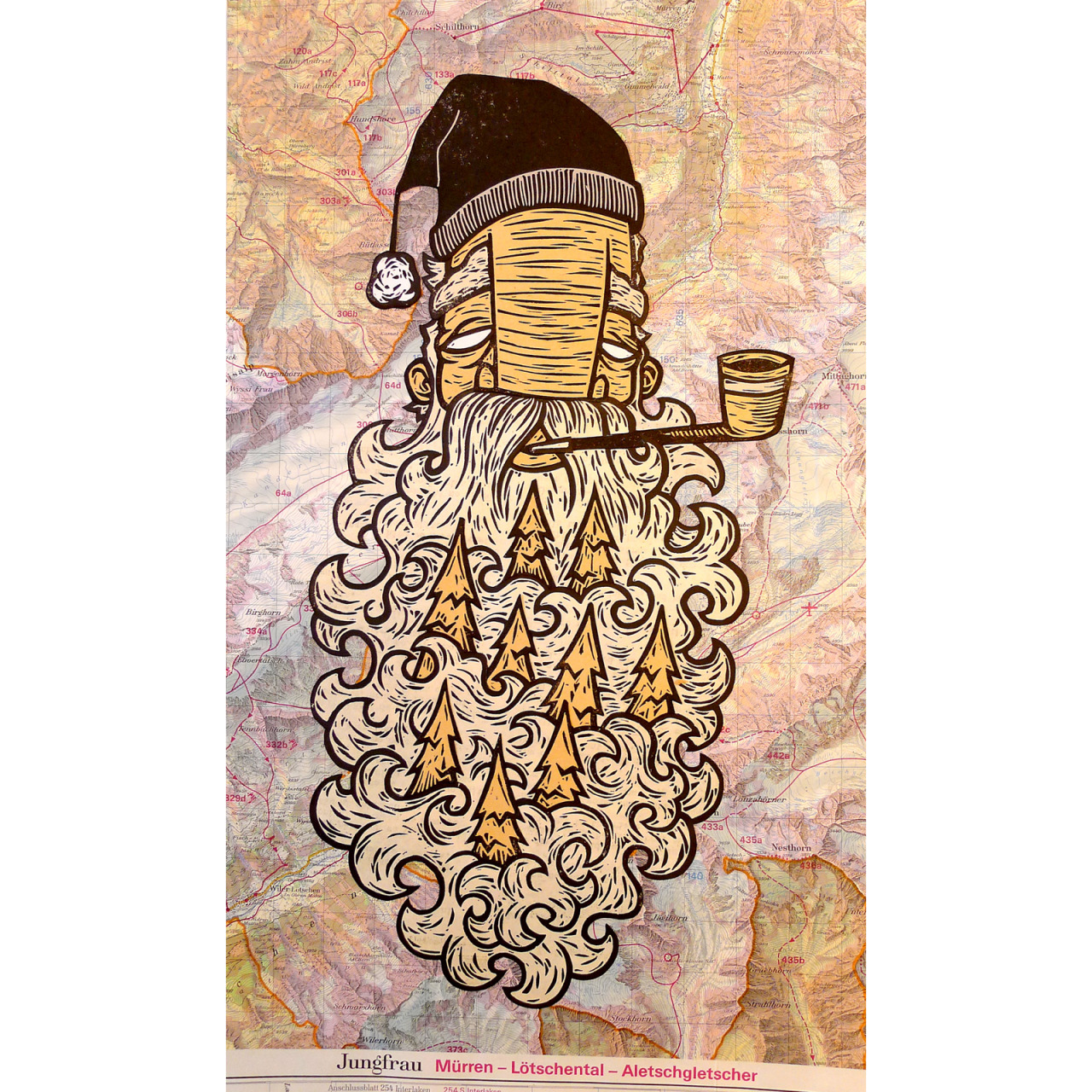


 Der Holzfaller / 10”x17” / linoleum carving collage on topographic map / 2013


Der Wanderer  /  10"x8"  / Linoleum carving collage on Swiss topo map  / 2014


I think John is one of my favourite artists, I love the idea of using maps in art, and especially when its the use of maps with print!!
I love the way he carves shapes and the way he designs the illustrative human face. He just very much makes my arty brain tick and think about how I can be better with lino, how to cut certain lines and what to do within my own work I guess.

He also posted his process on his website and that was pretty helpful.


Molly Hashimoto - Printmaking/Media handling

A lot of Molly's work are block prints with watercolour. I found Molly while I was cleaning a woman's house this morning and noticed her calendar in the kitchen and was instantly drawn to it and thought, "HEY!, I'm going to look into her for my Printmaking AND Exploratory Media Handling units!".
Molly lives in Seattle, Washington and her work is usually put into calendars, postcards, gift books, etc. Her work is usually of birds and nature... but mostly birds, I see... Her prints are put onto rag paper, and printed with oil-based inks and are hand tinted with Watercolour.

I think I'd enjoy this technique and defiantly going to try it, maybe use gouache too in my experiments.


Crow and Moon 8x10


Owl and moon


Crow, Moon and cherry blossoms 8x10


All of them have a great, illustrative use of line and colour and I don't particularly think I have a favourite print at all as they all appeal to me and I'm excited to get back to college to try this technique for myself :)

Ernst Ludwig Kirchner - Printmaking


Ernst Ludwig Kirchner was born on May 6th, 1880 in Aschaffenburg, Bavaria. Ernst was considered to be a part of the Expressionism and Die Brucke movements. Die Brucke was a group of German expressionist artists that came together in 1905, Ernst was one of the founding members.
Unfortunately Ernst committed suicide on June 15, 1938 while the Nazi's rose to power and their campaign against "Degenerate Art."

The human figure was very important to Ernst's work, he portrayed the figure in movement, as he believed that it expressed the natural form of the human body.

I selected a few prints of his that I particularly liked, throughout all of them that I've seen, I've discovered I love his style and graphic-ness in the prints, something I may want to attempt in any future lino prints I do myself.

Ernst Ludwig Kirchner, woodcut, portrait of henry van de veldes, 1917

Out of the three I've chosen I think this one is my favourite. I love the use of line and composition with the face and the landscape behind. I also love that there's so much to look at in this print, and I think the print just being black and white adds to it somehow.
interesting how simple line can hold so much detail.

Ernst Ludwig Kirchner: Man's Head, Self Portrait (1926) woodcut


Ernst Ludwig Kirchner - Tribulations of Love, 1915, Colour woodcut


These last two I decided to put in as they use colour and kind of the process of a reduction print.
Just like the first one, I like the use of line, and in this case I also love the use of colour.
All of his prints are very interesting and to me, very eye pleasing and I don't think I've seen one that I didn't like that much.


Monday, 8 May 2017

Jim Dine etchings


Jim Dine was born in June 16, 1935 and is an American printmaker and pop artist and is also considered to be a part of the Neo Dada movement.


The first image I came across was the one above, I liked it because its busy and dark due to the black/blue ink. It sort of makes me think of a hammer filled cityscape by the way the hammers have been placed together. Going on I noticed that there is also a say and a hand included. I like how scratchy and messy the image is completely. 

The second image I came across was of these wrenches and I found them interesting because this etching is a lot cleaner than the last. You can completely make out everything in the picture and nothing else jumps out at you, however in contrast I like this one as its a very clean etching I guess.


Lastly I came across this image, It contrasts completely with the images above as, well obviously its colourful. I find this one interesting as I had never thought about this process while experimenting with etching myself.


Saturday, 1 October 2016

John Berry

An artist named John Berry came to our class last week, he also has a studio at WASP in Selkirk.
He has a unique outlook at the world and didn't find anyone with the same views until he went to college.
He taught English in Istanbul while also doing some illustration jobs. He also helped to create "The Snowman"
He started doing Illustration and Graphic design jobs once he finished school but always loved collage, he got the opportunity to create a collage mural using books that were being thrown away -there were around 3000 books being thrown out, and he I still using them!!-
He is inspired by Piccasso and Kurt Schwitters' collages. He doesn't like using recognisable people in his collages so he uses old photos of people from years and years back and makes them into art. He also likes old paper and etc.

He is so far my favourite artist who has come to visit, he is interesting and i can really be inspired by him.

These are my favorites by John, they are all done on pieces of wood and they are displayed in a large group, i picked out 3 of my favorites to show. However my pictures are upside down and i'm not sure how to rotate them on here :s;


Monday, 26 September 2016

Goya, disasters of war

I stared looking at Goya's series of prints called the Disasters of War by looking into how it came about, I found that he produced 82 prints between 1810 and 1820, but were not put out until 1863.

I began looking through some of the prints he created, I think they were possibly political statements etchings and I read that they were in relation to what he had witnessed in the Peninsular war in 1807 – 1814.
The first image that really grabbed my attention was this one...
"Disparate general (General folly)"


I consider myself quite a morbid person, and while I was looking through these images although very powerful and violent, they did not shock me. Although it made me think about what kind of reaction he wanted to give to the viewer.

The more I looked at this image, the more I noted the darkness in it, in tone and in message, to me obviously on purpose.

I noticed the background has little to no detail in it and I noticed this in a lot of these etchings... they all appear to have a darkness in the backgrounds, it gives me the feeling of emptiness all around what is happening in the etchings. Here is another example of this I found.


"Modo de volar (A way of flying)"


"El caballo raptor (Kidnapping horse)"


I liked these, I liked the darkness to them again both in appearance and message, and it made me quite interested in trying out etching for myself. :)

Sunday, 18 September 2016

Mary Morrison

On Tuesday an artist named Mary Morrison came to visit our class to give a talk on her work, She is based in the Scottish Borders and was brought up in the Isle of Haris where she left at the age of 18.
She uses oil paint in different solutions, she explained that she can never come up with the same effect on a canvas twice and every piece of work is unique, Mary works on flat and can sometimes work on several paintings at once as they are oil paint and take forever to dry! She is inspired by the isle she grew up on and incorporates the waves in most of her paintings. She then moved on and was inspired by Abstract Musical Notation and eventually put two and two together and created beautiful work. She was then inspired by tide tables and grids and mapping and then continued to add them to her work to make interesting works.
She is currently based in WASP Studios in Selkirk and has been for the last 12 years. WASP Studios opens once to twice a year and is open on the 1st and 2nd of October and there are 13 other Artists based there.
Mary helped with the Bard Mhealboist project.

"Undersong"

--

This is her studio, as you can see from the picture its rather messy!